Please note : This help page is not for the latest version of Enterprise Architect. The latest help can be found here.
Contents |
| Prev | Next |
Kanban Diagram Options - Appearance
Using the 'Appearance' page, you can set the Kanban diagram appearance options such as the line and font colors and use of the Hand Drawn mode.
Objects on a Kanban diagram are, by default, drawn using the Info View style.
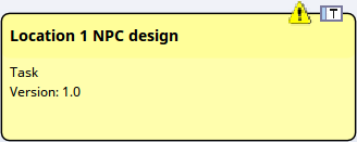
This style displays an icon on the top right corner of the element, representing the element type, with a triangular icon to the left of it representing the priority - red for High priority, and yellow for Medium priority. No icon shows for Low priority. The Priority, as for various other element properties, is also represented by a line of text in the body of the element. You can specify which properties are shown by selecting the appropriate checkbox from the list at the bottom of the 'Appearance' page.
Appearance Options
Option |
Action |
See also |
|---|---|---|
|
Font Color |
Click on the drop-down arrow and select the color in which to display the text in the Kanban lane and sub lane headings. If the color you require is not shown, click on the and either select from a wider range of standard colors or define a custom color. |
Create Custom Colors Standard Colors |
|
Line Color |
Click on the drop-down arrow and select the color in which to display lane borders. This color does not apply to sub lane borders, which are automatically set to a pale or dark color to contrast with the lane fill color. If the color you require is not shown, click on the and either select from a wider range of standard colors or define a custom color. The border style is automatically set to the 'chiseled' effect to give the appearance of 3D blocks on a background, the color of the background being the line color. The effect is more obvious if you set the line to a pale color and not black. |
Standard Colors Create Custom Colors |
|
A |
Click on this button to display the 'Font' dialog, through which you define the font and the style, size and effects of the text in the Kanban lane and sub lane headings. If you also change the text color here, it overrides the setting of the 'Font Color' field. |
Set Element Font |
|
Title Color |
Click on the drop-down arrow and select the color to use across the lane heading cells (separate from the fill colors you can apply individually to each of the lanes themselves). If the color you require is not shown, click on the and either select from a wider range of standard colors or define a custom color. |
Standard Colors Create Custom Colors |
|
Overfilled Color |
Click on the drop-down arrow and select the color with which to fill a lane heading cell if the lane contains more than the maximum number of elements. You set the maximum number of elements when you define the lanes to work with, in the 'Lanes' page. If the color you require is not shown, click on the and either select from a wider range of standard colors or define a custom color. |
Create Custom Colors Standard Colors |
|
Underfill Color |
Click on the drop-down arrow and select the color with which to fill a lane heading cell if the column contains fewer than the maximum number of elements, in other words there is available capacity. You set the maximum number of elements when you define the lanes to work with, in the 'Lanes' page. If the color you require is not shown, click on the and either select from a wider range of standard colors or define a custom color. |
|
|
Line Width |
Click on the drop-down arrow and select the line width of the Kanban lane borders - either 1 (thinnest), 2 or 3 (thickest). |
|
|
Vertical Spacing |
Set this to 'Small', 'Medium' or 'Large' to define the degree of vertical separation between elements in a Kanban lane. |
|
|
Hide Names |
Select this checkbox to hide the lane names and the column heading cells. |
|
|
Bold Font |
Select this checkbox to display the lane headings in bold (if their font definition does not already set them to bold). |
|
|
Hand Drawn |
Select this checkbox to display the Kanban lanes and the elements on the diagram in 'Hand-drawn' mode. |
Configure Diagram Display |
|
Enable Overfill Highlight |
Select this checkbox to apply the 'overfilled' color to the lane header cell if it contains more elements than the defined maximum number (see New). |
|
|
Enable Underfill Highlight |
Select this checkbox to apply the 'underfilled' color to the lane header cell if the lane contains fewer elements than the defined maximum number; that is, if it has any spare capacity. |
|
|
Use Kanban drawing style |
Select this option if you want to apply the Kanban style to the elements on this Kanban diagram. Also, select the checkbox against each element property or characteristic to be shown in the elements:
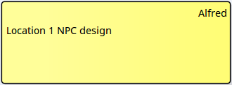
The property checkboxes are directly linked to the 'Use Kanban drawing style' option. If you do not select the option, the element on the Kanban diagram has a more basic appearance with no properties shown other than the Author and element names.
|
Notes
